Note
Go to the end to download the full example code or to run this example in your browser via JupyterLite or Binder.
Plot classification probability#
This example illustrates the use of
sklearn.inspection.DecisionBoundaryDisplay to plot the predicted class
probabilities of various classifiers in a 2D feature space, mostly for didactic
purposes.
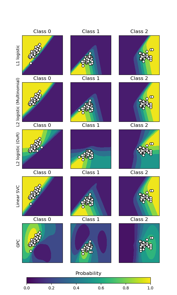
The first three columns show the predicted probability for varying values of the two features. Round markers represent the test data that was predicted to belong to that class.
In the last column, all three classes are represented on each plot; the class with the highest predicted probability at each point is plotted. The round markers show the test data and are colored by their true label.
# Authors: The scikit-learn developers
# SPDX-License-Identifier: BSD-3-Clause
import matplotlib as mpl
import matplotlib.pyplot as plt
import numpy as np
import pandas as pd
from matplotlib import cm

from sklearn import datasets
from sklearn.ensemble import HistGradientBoostingClassifier
from sklearn.gaussian_process import GaussianProcessClassifier
from sklearn.gaussian_process.kernels import RBF
from sklearn.inspection import DecisionBoundaryDisplay
from sklearn.kernel_approximation import Nystroem
from sklearn.linear_model import LogisticRegression
from sklearn.metrics import accuracy_score, log_loss, roc_auc_score
from sklearn.model_selection import train_test_split
from sklearn.pipeline import make_pipeline
from sklearn.preprocessing import (
    KBinsDiscretizer,
    PolynomialFeatures,
    SplineTransformer,
)
Data: 2D projection of the iris dataset#
iris = datasets.load_iris()
X = iris.data[:, 0:2]  # we only take the first two features for visualization
y = iris.target

X_train, X_test, y_train, y_test = train_test_split(
    X, y, test_size=0.5, random_state=42
)
Probabilistic classifiers#
We will plot the decision boundaries of several classifiers that have a
predict_proba method. This will allow us to visualize the uncertainty of
the classifier in regions where it is not certain of its prediction.
classifiers = {
    "Logistic regression\n(C=0.1)": LogisticRegression(C=0.1),
    "Logistic regression\n(C=100)": LogisticRegression(C=100),
    "Gaussian Process": GaussianProcessClassifier(kernel=1.0 * RBF([1.0, 1.0])),
    "Logistic regression\n(RBF features)": make_pipeline(
        Nystroem(kernel="rbf", gamma=5e-1, n_components=50, random_state=1),
        LogisticRegression(C=10),
    ),
    "Gradient Boosting": HistGradientBoostingClassifier(random_state=42),
    "Logistic regression\n(binned features)": make_pipeline(
        KBinsDiscretizer(n_bins=5, quantile_method="averaged_inverted_cdf"),
        PolynomialFeatures(interaction_only=True),
        LogisticRegression(C=10),
    ),
    "Logistic regression\n(spline features)": make_pipeline(
        SplineTransformer(n_knots=5),
        PolynomialFeatures(interaction_only=True),
        LogisticRegression(C=10),
    ),
}
Plotting the decision boundaries#
For each classifier, we plot the per-class probabilities on the first three columns and the probabilities of the most likely class on the last column.
n_classifiers = len(classifiers)
scatter_kwargs = {
    "s": 25,
    "marker": "o",
    "linewidths": 0.8,
    "edgecolor": "k",
    "alpha": 0.7,
}
y_unique = np.unique(y)

# Ensure legend not cut off
mpl.rcParams["savefig.bbox"] = "tight"
fig, axes = plt.subplots(
    nrows=n_classifiers,
    ncols=len(iris.target_names) + 1,
    figsize=(4 * 2.2, n_classifiers * 2.2),
)
evaluation_results = []
levels = 100
for classifier_idx, (name, classifier) in enumerate(classifiers.items()):
    y_pred = classifier.fit(X_train, y_train).predict(X_test)
    y_pred_proba = classifier.predict_proba(X_test)
    accuracy_test = accuracy_score(y_test, y_pred)
    roc_auc_test = roc_auc_score(y_test, y_pred_proba, multi_class="ovr")
    log_loss_test = log_loss(y_test, y_pred_proba)
    evaluation_results.append(
        {
            "name": name.replace("\n", " "),
            "accuracy": accuracy_test,
            "roc_auc": roc_auc_test,
            "log_loss": log_loss_test,
        }
    )
    for label in y_unique:
        # plot the probability estimate provided by the classifier
        disp = DecisionBoundaryDisplay.from_estimator(
            classifier,
            X_train,
            response_method="predict_proba",
            class_of_interest=label,
            ax=axes[classifier_idx, label],
            vmin=0,
            vmax=1,
            cmap="Blues",
            levels=levels,
        )
        axes[classifier_idx, label].set_title(f"Class {iris.target_names[label]}")
        # plot data predicted to belong to given class
        mask_y_pred = y_pred == label
        axes[classifier_idx, label].scatter(
            X_test[mask_y_pred, 0], X_test[mask_y_pred, 1], c="w", **scatter_kwargs
        )

        axes[classifier_idx, label].set(xticks=(), yticks=())
    # add column that shows all classes by plotting class with max 'predict_proba'
    max_class_disp = DecisionBoundaryDisplay.from_estimator(
        classifier,
        X_train,
        response_method="predict_proba",
        class_of_interest=None,
        ax=axes[classifier_idx, len(y_unique)],
        vmin=0,
        vmax=1,
        levels=levels,
    )
    for label in y_unique:
        mask_label = y_test == label
        max_col = len(y_unique)
        axes[classifier_idx, max_col].scatter(
            X_test[mask_label, 0],
            X_test[mask_label, 1],
            c=max_class_disp.target_colors_[[label], :],
            **scatter_kwargs,
        )

    axes[classifier_idx, 3].set(xticks=(), yticks=())
    axes[classifier_idx, 3].set_title("Max class")
    axes[classifier_idx, 0].set_ylabel(name)

# colorbar for single class plots
ax_single = fig.add_axes([0.15, 0.01, 0.5, 0.02])
plt.title("Probability")
_ = plt.colorbar(
    cm.ScalarMappable(norm=None, cmap=disp.surface_.cmap),
    cax=ax_single,
    orientation="horizontal",
)

# colorbars for max probability class column
max_class_cmaps = [s.cmap for s in max_class_disp.surface_]

for label in y_unique:
    ax_max = fig.add_axes([0.73, (0.06 - (label * 0.04)), 0.16, 0.015])
    plt.title(f"Probability class {label}", fontsize=10)
    _ = plt.colorbar(
        cm.ScalarMappable(norm=None, cmap=max_class_cmaps[label]),
        cax=ax_max,
        orientation="horizontal",
    )
    if label in (0, 1):
        ax_max.set(xticks=(), yticks=())
Quantitative evaluation#
pd.DataFrame(evaluation_results).round(2)
Analysis#
The two logistic regression models fitted on the original features display
linear decision boundaries as expected. For this particular problem, this
does not seem to be detrimental as both models are competitive with the
non-linear models when quantitatively evaluated on the test set. We can
observe that the amount of regularization influences the model confidence:
lighter colors for the strongly regularized model with a lower value of C.
Regularization also impacts the orientation of decision boundary leading to
slightly different ROC AUC.
The log-loss on the other hand evaluates both sharpness and calibration and
as a result strongly favors the weakly regularized logistic-regression model,
probably because the strongly regularized model is under-confident. This
could be confirmed by looking at the calibration curve using
sklearn.calibration.CalibrationDisplay.
The logistic regression model with RBF features has a “blobby” decision boundary that is non-linear in the original feature space and is quite similar to the decision boundary of the Gaussian process classifier which is configured to use an RBF kernel.
The logistic regression model fitted on binned features with interactions has a decision boundary that is non-linear in the original feature space and is quite similar to the decision boundary of the gradient boosting classifier: both models favor axis-aligned decisions when extrapolating to unseen region of the feature space.
The logistic regression model fitted on spline features with interactions has a similar axis-aligned extrapolation behavior but a smoother decision boundary in the dense region of the feature space than the two previous models.
To conclude, it is interesting to observe that feature engineering for logistic regression models can be used to mimic some of the inductive bias of various non-linear models. However, for this particular dataset, using the raw features is enough to train a competitive model. This would not necessarily the case for other datasets.
Total running time of the script: (0 minutes 2.521 seconds)
Related examples
Visualizing the probabilistic predictions of a VotingClassifier
Restricted Boltzmann Machine features for digit classification
Decision Boundaries of Multinomial and One-vs-Rest Logistic Regression