Note
Go to the end to download the full example code or to run this example in your browser via JupyterLite or Binder.
Lagged features for time series forecasting#
This example demonstrates how Polars-engineered lagged features can be used
for time series forecasting with
HistGradientBoostingRegressor on the Bike Sharing
Demand dataset.
See the example on Time-related feature engineering for some data exploration on this dataset and a demo on periodic feature engineering.
# Authors: The scikit-learn developers
# SPDX-License-Identifier: BSD-3-Clause
Analyzing the Bike Sharing Demand dataset#
We start by loading the data from the OpenML repository as a raw parquet file
to illustrate how to work with an arbitrary parquet file instead of hiding this
step in a convenience tool such as sklearn.datasets.fetch_openml.
The URL of the parquet file can be found in the JSON description of the Bike Sharing Demand dataset with id 44063 on openml.org (https://openml.org/search?type=data&status=active&id=44063).
The sha256 hash of the file is also provided to ensure the integrity of the
downloaded file.
import numpy as np
import polars as pl

from sklearn.datasets import fetch_file

pl.Config.set_fmt_str_lengths(20)

bike_sharing_data_file = fetch_file(
    "https://data.openml.org/datasets/0004/44063/dataset_44063.pq",
    sha256="d120af76829af0d256338dc6dd4be5df4fd1f35bf3a283cab66a51c1c6abd06a",
)
bike_sharing_data_file
PosixPath('/home/circleci/scikit_learn_data/data.openml.org/datasets_0004_44063/dataset_44063.pq')
We load the parquet file with Polars for feature engineering. Polars
automatically caches common subexpressions which are reused in multiple
expressions (like pl.col("count").shift(1) below). See
https://docs.pola.rs/user-guide/lazy/optimizations/ for more information.
df = pl.read_parquet(bike_sharing_data_file)
Next, we take a look at the statistical summary of the dataset so that we can better understand the data that we are working with.
import polars.selectors as cs

summary = df.select(cs.numeric()).describe()
summary
Let us look at the count of the seasons "fall", "spring", "summer"
and "winter" present in the dataset to confirm they are balanced.
import matplotlib.pyplot as plt

df["season"].value_counts()
Generating Polars-engineered lagged features#
Let’s consider the problem of predicting the demand at the
next hour given past demands. Since the demand is a continuous
variable, one could intuitively use any regression model. However, we do
not have the usual (X_train, y_train) dataset. Instead, we just have
the y_train demand data sequentially organized by time.
lagged_df = df.select(
    "count",
    *[pl.col("count").shift(i).alias(f"lagged_count_{i}h") for i in [1, 2, 3]],
    lagged_count_1d=pl.col("count").shift(24),
    lagged_count_1d_1h=pl.col("count").shift(24 + 1),
    lagged_count_7d=pl.col("count").shift(7 * 24),
    lagged_count_7d_1h=pl.col("count").shift(7 * 24 + 1),
    lagged_mean_24h=pl.col("count").shift(1).rolling_mean(24),
    lagged_max_24h=pl.col("count").shift(1).rolling_max(24),
    lagged_min_24h=pl.col("count").shift(1).rolling_min(24),
    lagged_mean_7d=pl.col("count").shift(1).rolling_mean(7 * 24),
    lagged_max_7d=pl.col("count").shift(1).rolling_max(7 * 24),
    lagged_min_7d=pl.col("count").shift(1).rolling_min(7 * 24),
)
lagged_df.tail(10)
Watch out however, the first lines have undefined values because their own past is unknown. This depends on how much lag we used:
lagged_df.head(10)
We can now separate the lagged features in a matrix X and the target variable
(the counts to predict) in an array of the same first dimension y.
lagged_df = lagged_df.drop_nulls()
X = lagged_df.drop("count")
y = lagged_df["count"]
print("X shape: {}\ny shape: {}".format(X.shape, y.shape))
X shape: (17210, 13)
y shape: (17210,)
Naive evaluation of the next hour bike demand regression#
Let’s randomly split our tabularized dataset to train a gradient boosting regression tree (GBRT) model and evaluate it using Mean Absolute Percentage Error (MAPE). If our model is aimed at forecasting (i.e., predicting future data from past data), we should not use training data that are ulterior to the testing data. In time series machine learning the “i.i.d” (independent and identically distributed) assumption does not hold true as the data points are not independent and have a temporal relationship.
from sklearn.ensemble import HistGradientBoostingRegressor
from sklearn.model_selection import train_test_split

X_train, X_test, y_train, y_test = train_test_split(
    X, y, test_size=0.2, random_state=42
)

model = HistGradientBoostingRegressor().fit(X_train, y_train)
Taking a look at the performance of the model.
from sklearn.metrics import mean_absolute_percentage_error

y_pred = model.predict(X_test)
mean_absolute_percentage_error(y_test, y_pred)
0.39639694633413675
Proper next hour forecasting evaluation#
Let’s use a proper evaluation splitting strategies that takes into account the temporal structure of the dataset to evaluate our model’s ability to predict data points in the future (to avoid cheating by reading values from the lagged features in the training set).
from sklearn.model_selection import TimeSeriesSplit

ts_cv = TimeSeriesSplit(
    n_splits=3,  # to keep the notebook fast enough on common laptops
    gap=48,  # 2 days data gap between train and test
    max_train_size=10000,  # keep train sets of comparable sizes
    test_size=3000,  # for 2 or 3 digits of precision in scores
)
all_splits = list(ts_cv.split(X, y))
Training the model and evaluating its performance based on MAPE.
train_idx, test_idx = all_splits[0]
X_train, X_test = X[train_idx, :], X[test_idx, :]
y_train, y_test = y[train_idx], y[test_idx]

model = HistGradientBoostingRegressor().fit(X_train, y_train)
y_pred = model.predict(X_test)
mean_absolute_percentage_error(y_test, y_pred)
0.45822977660508035
The generalization error measured via a shuffled trained test split is too optimistic. The generalization via a time-based split is likely to be more representative of the true performance of the regression model. Let’s assess this variability of our error evaluation with proper cross-validation:
from sklearn.model_selection import cross_val_score

cv_mape_scores = -cross_val_score(
    model, X, y, cv=ts_cv, scoring="neg_mean_absolute_percentage_error"
)
cv_mape_scores
array([0.45822978, 0.2825124 , 0.36374485])
The variability across splits is quite large! In a real life setting it would be advised to use more splits to better assess the variability. Let’s report the mean CV scores and their standard deviation from now on.
print(f"CV MAPE: {cv_mape_scores.mean():.3f} ± {cv_mape_scores.std():.3f}")
CV MAPE: 0.368 ± 0.072
We can compute several combinations of evaluation metrics and loss functions, which are reported a bit below.
from collections import defaultdict

from sklearn.metrics import (
    make_scorer,
    mean_absolute_error,
    mean_pinball_loss,
    root_mean_squared_error,
)
from sklearn.model_selection import cross_validate


def consolidate_scores(cv_results, scores, metric):
    if metric == "MAPE":
        scores[metric].append(f"{value.mean():.2f} ± {value.std():.2f}")
    else:
        scores[metric].append(f"{value.mean():.1f} ± {value.std():.1f}")

    return scores


scoring = {
    "MAPE": make_scorer(mean_absolute_percentage_error),
    "RMSE": make_scorer(root_mean_squared_error),
    "MAE": make_scorer(mean_absolute_error),
    "pinball_loss_05": make_scorer(mean_pinball_loss, alpha=0.05),
    "pinball_loss_50": make_scorer(mean_pinball_loss, alpha=0.50),
    "pinball_loss_95": make_scorer(mean_pinball_loss, alpha=0.95),
}
loss_functions = ["squared_error", "poisson", "absolute_error"]
scores = defaultdict(list)
for loss_func in loss_functions:
    model = HistGradientBoostingRegressor(loss=loss_func)
    cv_results = cross_validate(
        model,
        X,
        y,
        cv=ts_cv,
        scoring=scoring,
        n_jobs=2,
    )
    time = cv_results["fit_time"]
    scores["loss"].append(loss_func)
    scores["fit_time"].append(f"{time.mean():.2f} ± {time.std():.2f} s")

    for key, value in cv_results.items():
        if key.startswith("test_"):
            metric = key.split("test_")[1]
            scores = consolidate_scores(cv_results, scores, metric)
Modeling predictive uncertainty via quantile regression#
Instead of modeling the expected value of the distribution of \(Y|X\) like the least squares and Poisson losses do, one could try to estimate quantiles of the conditional distribution.
\(Y|X=x_i\) is expected to be a random variable for a given data point \(x_i\) because we expect that the number of rentals cannot be 100% accurately predicted from the features. It can be influenced by other variables not properly captured by the existing lagged features. For instance whether or not it will rain in the next hour cannot be fully anticipated from the past hours bike rental data. This is what we call aleatoric uncertainty.
Quantile regression makes it possible to give a finer description of that distribution without making strong assumptions on its shape.
quantile_list = [0.05, 0.5, 0.95]

for quantile in quantile_list:
    model = HistGradientBoostingRegressor(loss="quantile", quantile=quantile)
    cv_results = cross_validate(
        model,
        X,
        y,
        cv=ts_cv,
        scoring=scoring,
        n_jobs=2,
    )
    time = cv_results["fit_time"]
    scores["fit_time"].append(f"{time.mean():.2f} ± {time.std():.2f} s")

    scores["loss"].append(f"quantile {int(quantile * 100)}")
    for key, value in cv_results.items():
        if key.startswith("test_"):
            metric = key.split("test_")[1]
            scores = consolidate_scores(cv_results, scores, metric)

scores_df = pl.DataFrame(scores)
scores_df
Let us take a look at the losses that minimise each metric.
def min_arg(col):
    col_split = pl.col(col).str.split(" ")
    return pl.arg_sort_by(
        col_split.list.get(0).cast(pl.Float64),
        col_split.list.get(2).cast(pl.Float64),
    ).first()


scores_df.select(
    pl.col("loss").get(min_arg(col_name)).alias(col_name)
    for col_name in scores_df.columns
    if col_name != "loss"
)
Even if the score distributions overlap due to the variance in the dataset,
it is true that the average RMSE is lower when loss="squared_error", whereas
the average MAPE is lower when loss="absolute_error" as expected. That is
also the case for the Mean Pinball Loss with the quantiles 5 and 95. The score
corresponding to the 50 quantile loss is overlapping with the score obtained
by minimizing other loss functions, which is also the case for the MAE.
A qualitative look at the predictions#
We can now visualize the performance of the model with regards to the 5th percentile, median and the 95th percentile:
all_splits = list(ts_cv.split(X, y))
train_idx, test_idx = all_splits[0]

X_train, X_test = X[train_idx, :], X[test_idx, :]
y_train, y_test = y[train_idx], y[test_idx]

max_iter = 50
gbrt_mean_poisson = HistGradientBoostingRegressor(loss="poisson", max_iter=max_iter)
gbrt_mean_poisson.fit(X_train, y_train)
mean_predictions = gbrt_mean_poisson.predict(X_test)

gbrt_median = HistGradientBoostingRegressor(
    loss="quantile", quantile=0.5, max_iter=max_iter
)
gbrt_median.fit(X_train, y_train)
median_predictions = gbrt_median.predict(X_test)

gbrt_percentile_5 = HistGradientBoostingRegressor(
    loss="quantile", quantile=0.05, max_iter=max_iter
)
gbrt_percentile_5.fit(X_train, y_train)
percentile_5_predictions = gbrt_percentile_5.predict(X_test)

gbrt_percentile_95 = HistGradientBoostingRegressor(
    loss="quantile", quantile=0.95, max_iter=max_iter
)
gbrt_percentile_95.fit(X_train, y_train)
percentile_95_predictions = gbrt_percentile_95.predict(X_test)
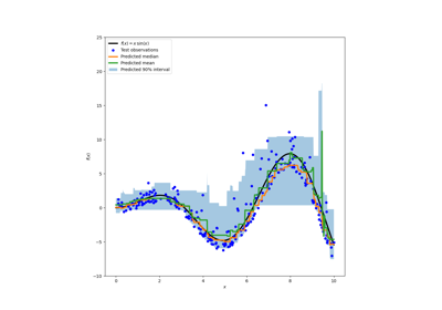
We can now take a look at the predictions made by the regression models:
last_hours = slice(-96, None)
fig, ax = plt.subplots(figsize=(15, 7))
plt.title("Predictions by regression models")
ax.plot(
    y_test[last_hours],
    "x-",
    alpha=0.2,
    label="Actual demand",
    color="black",
)
ax.plot(
    median_predictions[last_hours],
    "^-",
    label="GBRT median",
)
ax.plot(
    mean_predictions[last_hours],
    "x-",
    label="GBRT mean (Poisson)",
)
ax.fill_between(
    np.arange(96),
    percentile_5_predictions[last_hours],
    percentile_95_predictions[last_hours],
    alpha=0.3,
    label="GBRT 90% interval",
)
_ = ax.legend()
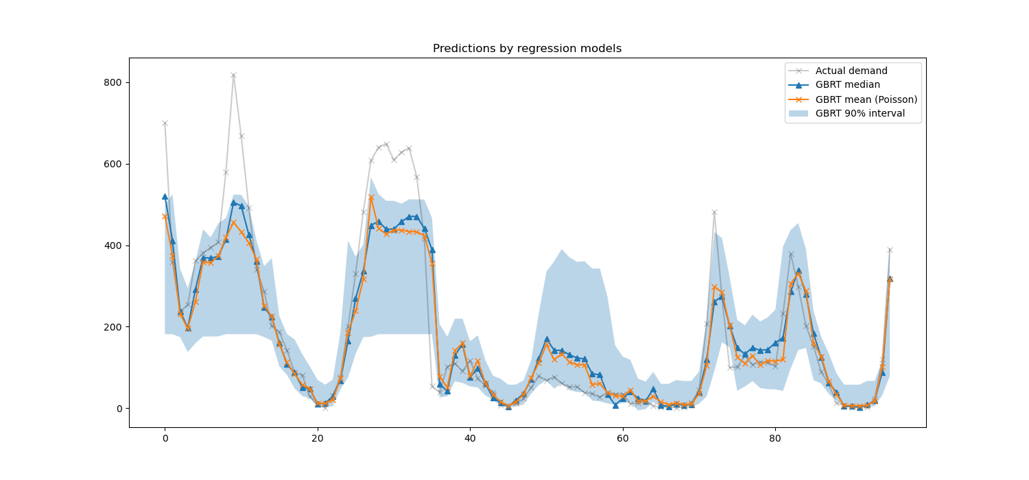
Here it’s interesting to notice that the blue area between the 5% and 95% percentile estimators has a width that varies with the time of the day:
At night, the blue band is much narrower: the pair of models is quite certain that there will be a small number of bike rentals. And furthermore these seem correct in the sense that the actual demand stays in that blue band.
During the day, the blue band is much wider: the uncertainty grows, probably because of the variability of the weather that can have a very large impact, especially on week-ends.
We can also see that during week-days, the commute pattern is still visible in the 5% and 95% estimations.
Finally, it is expected that 10% of the time, the actual demand does not lie between the 5% and 95% percentile estimates. On this test span, the actual demand seems to be higher, especially during the rush hours. It might reveal that our 95% percentile estimator underestimates the demand peaks. This could be be quantitatively confirmed by computing empirical coverage numbers as done in the calibration of confidence intervals.
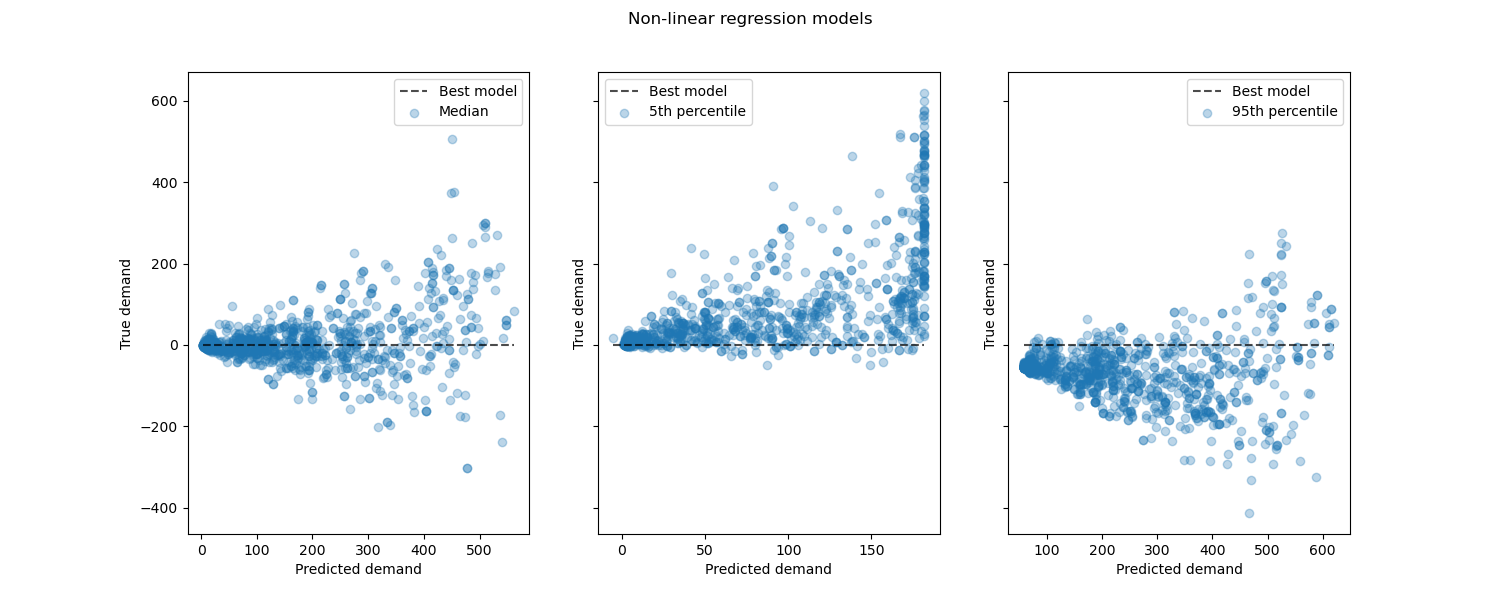
Looking at the performance of non-linear regression models vs the best models:
from sklearn.metrics import PredictionErrorDisplay

fig, axes = plt.subplots(ncols=3, figsize=(15, 6), sharey=True)
fig.suptitle("Non-linear regression models")
predictions = [
    median_predictions,
    percentile_5_predictions,
    percentile_95_predictions,
]
labels = [
    "Median",
    "5th percentile",
    "95th percentile",
]
for ax, pred, label in zip(axes, predictions, labels):
    PredictionErrorDisplay.from_predictions(
        y_true=y_test,
        y_pred=pred,
        kind="residual_vs_predicted",
        scatter_kwargs={"alpha": 0.3},
        ax=ax,
    )
    ax.set(xlabel="Predicted demand", ylabel="True demand")
    ax.legend(["Best model", label])

plt.show()
Conclusion#
Through this example we explored time series forecasting using lagged
features. We compared a naive regression (using the standardized
train_test_split) with a proper time
series evaluation strategy using
TimeSeriesSplit. We observed that the
model trained using train_test_split,
having a default value of shuffle set to True produced an overly
optimistic Mean Average Percentage Error (MAPE). The results
produced from the time-based split better represent the performance
of our time-series regression model. We also analyzed the predictive uncertainty
of our model via Quantile Regression. Predictions based on the 5th and
95th percentile using loss="quantile" provide us with a quantitative estimate
of the uncertainty of the forecasts made by our time series regression model.
Uncertainty estimation can also be performed
using MAPIE,
that provides an implementation based on recent work on conformal prediction
methods and estimates both aleatoric and epistemic uncertainty at the same time.
Furthermore, functionalities provided
by sktime
can be used to extend scikit-learn estimators by making use of recursive time
series forecasting, that enables dynamic predictions of future values.
Total running time of the script: (0 minutes 8.311 seconds)
Related examples
Balance model complexity and cross-validated score
Prediction Intervals for Gradient Boosting Regression