Note
Go to the end to download the full example code or to run this example in your browser via JupyterLite or Binder.
Detection error tradeoff (DET) curve#
In this example, we compare two binary classification multi-threshold metrics: the Receiver Operating Characteristic (ROC) and the Detection Error Tradeoff (DET). For such purpose, we evaluate two different classifiers for the same classification task.
ROC curves feature true positive rate (TPR) on the Y axis, and false positive rate (FPR) on the X axis. This means that the top left corner of the plot is the “ideal” point - a FPR of zero, and a TPR of one.
DET curves are a variation of ROC curves where False Negative Rate (FNR) is plotted on the y-axis instead of the TPR. In this case the origin (bottom left corner) is the “ideal” point.
Note
See
sklearn.metrics.roc_curvefor further information about ROC curves.See
sklearn.metrics.det_curvefor further information about DET curves.This example is loosely based on Classifier comparison example.
See Receiver Operating Characteristic (ROC) with cross validation for an example estimating the variance of the ROC curves and ROC-AUC.
# Authors: The scikit-learn developers
# SPDX-License-Identifier: BSD-3-Clause
Generate synthetic data#
from sklearn.datasets import make_classification
from sklearn.model_selection import train_test_split
from sklearn.preprocessing import StandardScaler

X, y = make_classification(
    n_samples=1_000,
    n_features=2,
    n_redundant=0,
    n_informative=2,
    random_state=1,
    n_clusters_per_class=1,
)

X_train, X_test, y_train, y_test = train_test_split(X, y, test_size=0.4, random_state=0)
Define the classifiers#
Here we define two different classifiers. The goal is to visually compare their statistical performance across thresholds using the ROC and DET curves.
from sklearn.dummy import DummyClassifier
from sklearn.ensemble import RandomForestClassifier
from sklearn.pipeline import make_pipeline
from sklearn.svm import LinearSVC

classifiers = {
    "Linear SVM": make_pipeline(StandardScaler(), LinearSVC(C=0.025)),
    "Random Forest": RandomForestClassifier(
        max_depth=5, n_estimators=10, max_features=1, random_state=0
    ),
    "Non-informative baseline": DummyClassifier(),
}
Compare ROC and DET curves#
DET curves are commonly plotted in normal deviate scale. To achieve this the
DET display transforms the error rates as returned by the
det_curve and the axis scale using
scipy.stats.norm.
import matplotlib.pyplot as plt

from sklearn.dummy import DummyClassifier
from sklearn.metrics import DetCurveDisplay, RocCurveDisplay

fig, [ax_roc, ax_det] = plt.subplots(1, 2, figsize=(11, 5))

ax_roc.set_title("Receiver Operating Characteristic (ROC) curves")
ax_det.set_title("Detection Error Tradeoff (DET) curves")

ax_roc.grid(linestyle="--")
ax_det.grid(linestyle="--")

for name, clf in classifiers.items():
    (color, linestyle) = (
        ("black", "--") if name == "Non-informative baseline" else (None, None)
    )
    clf.fit(X_train, y_train)
    RocCurveDisplay.from_estimator(
        clf,
        X_test,
        y_test,
        ax=ax_roc,
        name=name,
        curve_kwargs=dict(color=color, linestyle=linestyle),
    )
    DetCurveDisplay.from_estimator(
        clf, X_test, y_test, ax=ax_det, name=name, color=color, linestyle=linestyle
    )

plt.legend()
plt.show()
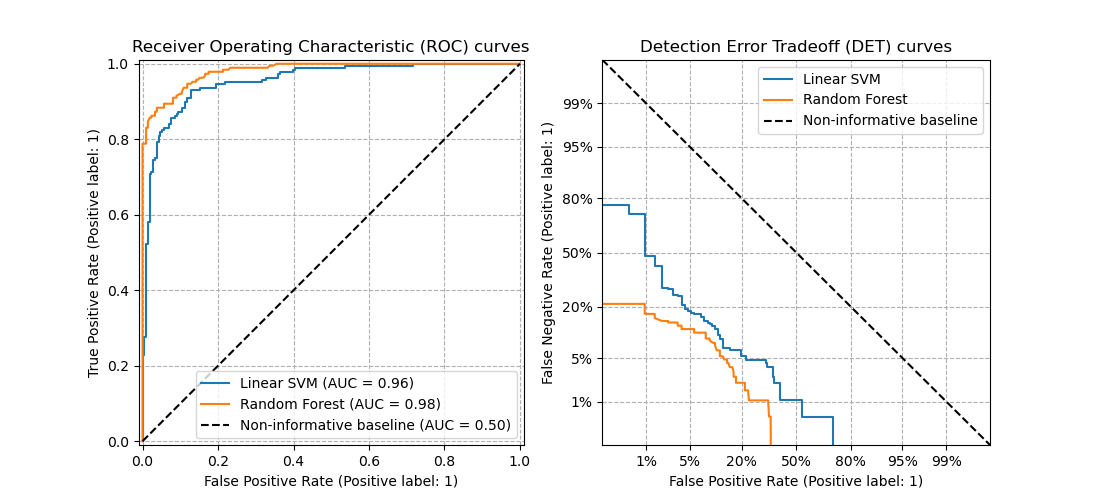
Notice that it is easier to visually assess the overall performance of different classification algorithms using DET curves than using ROC curves. As ROC curves are plot in a linear scale, different classifiers usually appear similar for a large part of the plot and differ the most in the top left corner of the graph. On the other hand, because DET curves represent straight lines in normal deviate scale, they tend to be distinguishable as a whole and the area of interest spans a large part of the plot.
DET curves give direct feedback of the detection error tradeoff to aid in operating point analysis. The user can then decide the FNR they are willing to accept at the expense of the FPR (or vice-versa).
Non-informative classifier baseline for the ROC and DET curves#
The diagonal black-dotted lines in the plots above correspond to a
DummyClassifier using the default “prior” strategy, to
serve as baseline for comparison with other classifiers. This classifier makes
constant predictions, independent of the input features in X, making it a
non-informative classifier.
To further understand the non-informative baseline of the ROC and DET curves, we recall the following mathematical definitions:
\(\text{FPR} = \frac{\text{FP}}{\text{FP} + \text{TN}}\)
\(\text{FNR} = \frac{\text{FN}}{\text{TP} + \text{FN}}\)
\(\text{TPR} = \frac{\text{TP}}{\text{TP} + \text{FN}}\)
A classifier that always predict the positive class would have no true negatives nor false negatives, giving \(\text{FPR} = \text{TPR} = 1\) and \(\text{FNR} = 0\), i.e.:
a single point in the upper right corner of the ROC plane,
a single point in the lower right corner of the DET plane.
Similarly, a classifier that always predict the negative class would have no true positives nor false positives, thus \(\text{FPR} = \text{TPR} = 0\) and \(\text{FNR} = 1\), i.e.:
a single point in the lower left corner of the ROC plane,
a single point in the upper left corner of the DET plane.
Total running time of the script: (0 minutes 0.230 seconds)
Related examples
Receiver Operating Characteristic (ROC) with cross validation
Multiclass Receiver Operating Characteristic (ROC)