Note
Go to the end to download the full example code or to run this example in your browser via JupyterLite or Binder.
A demo of the Spectral Biclustering algorithm#
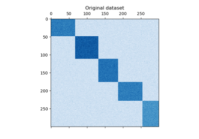
This example demonstrates how to generate a checkerboard dataset and bicluster
it using the SpectralBiclustering algorithm. The
spectral biclustering algorithm is specifically designed to cluster data by
simultaneously considering both the rows (samples) and columns (features) of a
matrix. It aims to identify patterns not only between samples but also within
subsets of samples, allowing for the detection of localized structure within the
data. This makes spectral biclustering particularly well-suited for datasets
where the order or arrangement of features is fixed, such as in images, time
series, or genomes.
The data is generated, then shuffled and passed to the spectral biclustering algorithm. The rows and columns of the shuffled matrix are then rearranged to plot the biclusters found.
# Authors: The scikit-learn developers
# SPDX-License-Identifier: BSD-3-Clause
Generate sample data#
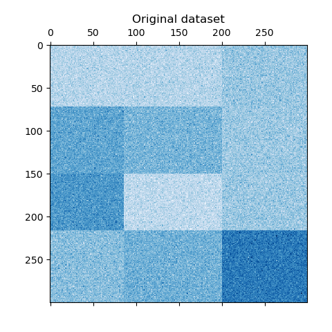
We generate the sample data using the
make_checkerboard function. Each pixel within
shape=(300, 300) represents with its color a value from a uniform
distribution. The noise is added from a normal distribution, where the value
chosen for noise is the standard deviation.
As you can see, the data is distributed over 12 cluster cells and is relatively well distinguishable.
from matplotlib import pyplot as plt

from sklearn.datasets import make_checkerboard

n_clusters = (4, 3)
data, rows, columns = make_checkerboard(
    shape=(300, 300), n_clusters=n_clusters, noise=10, shuffle=False, random_state=42
)

plt.matshow(data, cmap=plt.cm.Blues)
plt.title("Original dataset")
plt.show()
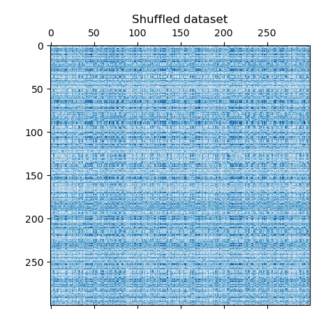
We shuffle the data and the goal is to reconstruct it afterwards using
SpectralBiclustering.
import numpy as np

# Creating lists of shuffled row and column indices
rng = np.random.RandomState(0)
row_idx_shuffled = rng.permutation(data.shape[0])
col_idx_shuffled = rng.permutation(data.shape[1])
We redefine the shuffled data and plot it. We observe that we lost the structure of original data matrix.
data = data[row_idx_shuffled][:, col_idx_shuffled]

plt.matshow(data, cmap=plt.cm.Blues)
plt.title("Shuffled dataset")
plt.show()
Fitting SpectralBiclustering#
We fit the model and compare the obtained clusters with the ground truth. Note
that when creating the model we specify the same number of clusters that we
used to create the dataset (n_clusters = (4, 3)), which will contribute to
obtain a good result.
from sklearn.cluster import SpectralBiclustering
from sklearn.metrics import consensus_score

model = SpectralBiclustering(n_clusters=n_clusters, method="log", random_state=0)
model.fit(data)

# Compute the similarity of two sets of biclusters
score = consensus_score(
    model.biclusters_, (rows[:, row_idx_shuffled], columns[:, col_idx_shuffled])
)
print(f"consensus score: {score:.1f}")
consensus score: 1.0
The score is between 0 and 1, where 1 corresponds to a perfect matching. It shows the quality of the biclustering.
Plotting results#
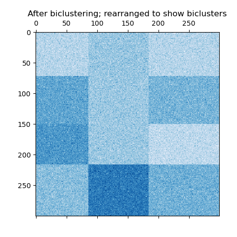
Now, we rearrange the data based on the row and column labels assigned by the
SpectralBiclustering model in ascending order and
plot again. The row_labels_ range from 0 to 3, while the column_labels_
range from 0 to 2, representing a total of 4 clusters per row and 3 clusters
per column.
# Reordering first the rows and then the columns.
reordered_rows = data[np.argsort(model.row_labels_)]
reordered_data = reordered_rows[:, np.argsort(model.column_labels_)]

plt.matshow(reordered_data, cmap=plt.cm.Blues)
plt.title("After biclustering; rearranged to show biclusters")
plt.show()
As a last step, we want to demonstrate the relationships between the row
and column labels assigned by the model. Therefore, we create a grid with
numpy.outer, which takes the sorted row_labels_ and column_labels_
and adds 1 to each to ensure that the labels start from 1 instead of 0 for
better visualization.
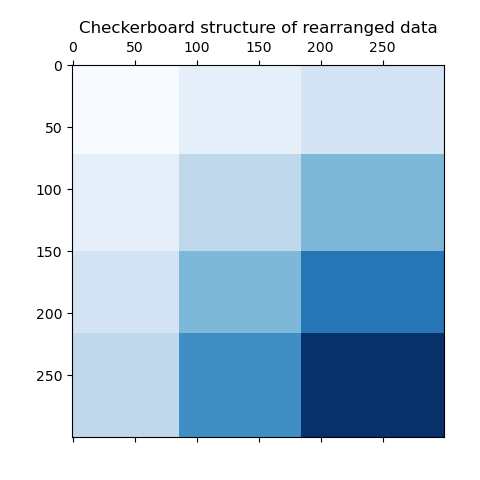
The outer product of the row and column label vectors shows a representation of the checkerboard structure, where different combinations of row and column labels are represented by different shades of blue.
Total running time of the script: (0 minutes 0.516 seconds)
Related examples
Selecting the number of clusters with silhouette analysis on KMeans clustering
Comparing different clustering algorithms on toy datasets
Comparing different hierarchical linkage methods on toy datasets
