PredictionErrorDisplay#
- class sklearn.metrics.PredictionErrorDisplay(*, y_true, y_pred)[source]#
Visualization of the prediction error of a regression model.
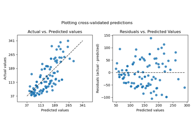
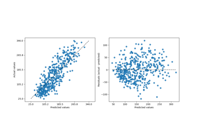
This tool can display “residuals vs predicted” or “actual vs predicted” using scatter plots to qualitatively assess the behavior of a regressor, preferably on held-out data points.
See the details in the docstrings of
from_estimatororfrom_predictionsto create a visualizer. All parameters are stored as attributes.For general information regarding
scikit-learnvisualization tools, read more in the Visualization Guide. For details regarding interpreting these plots, refer to the Model Evaluation Guide.Added in version 1.2.
- Parameters:
- y_truendarray of shape (n_samples,)
True values.
- y_predndarray of shape (n_samples,)
Prediction values.
- Attributes:
- line_matplotlib Artist
Optimal line representing
y_true == y_pred. Therefore, it is a diagonal line forkind="predictions"and a horizontal line forkind="residuals".- errors_lines_matplotlib Artist or None
Residual lines. If
with_errors=False, then it is set toNone.- scatter_matplotlib Artist
Scatter data points.
- ax_matplotlib Axes
Axes with the different matplotlib axis.
- figure_matplotlib Figure
Figure containing the scatter and lines.
See also
PredictionErrorDisplay.from_estimatorPrediction error visualization given an estimator and some data.
PredictionErrorDisplay.from_predictionsPrediction error visualization given the true and predicted targets.
Examples
>>> import matplotlib.pyplot as plt
>>> from sklearn.datasets import load_diabetes
>>> from sklearn.linear_model import Ridge
>>> from sklearn.metrics import PredictionErrorDisplay
>>> X, y = load_diabetes(return_X_y=True)
>>> ridge = Ridge().fit(X, y)
>>> y_pred = ridge.predict(X)
>>> display = PredictionErrorDisplay(y_true=y, y_pred=y_pred)
>>> display.plot()
<...>
>>> plt.show()

- classmethod from_estimator(estimator, X, y, *, kind='residual_vs_predicted', subsample=1000, random_state=None, ax=None, scatter_kwargs=None, line_kwargs=None)[source]#
Plot the prediction error given a regressor and some data.
For general information regarding
scikit-learnvisualization tools, read more in the Visualization Guide. For details regarding interpreting these plots, refer to the Model Evaluation Guide.Added in version 1.2.
- Parameters:
- estimatorestimator instance
Fitted regressor or a fitted
Pipelinein which the last estimator is a regressor.- X{array-like, sparse matrix} of shape (n_samples, n_features)
Input values.
- yarray-like of shape (n_samples,)
Target values.
- kind{“actual_vs_predicted”, “residual_vs_predicted”}, default=”residual_vs_predicted”
The type of plot to draw:
“actual_vs_predicted” draws the observed values (y-axis) vs. the predicted values (x-axis).
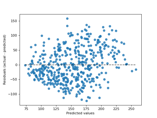
“residual_vs_predicted” draws the residuals, i.e. difference between observed and predicted values, (y-axis) vs. the predicted values (x-axis).
- subsamplefloat, int or None, default=1_000
Sampling the samples to be shown on the scatter plot. If
float, it should be between 0 and 1 and represents the proportion of the original dataset. Ifint, it represents the number of samples display on the scatter plot. IfNone, no subsampling will be applied. by default, 1000 samples or less will be displayed.- random_stateint or RandomState, default=None
Controls the randomness when
subsampleis notNone. See Glossary for details.- axmatplotlib axes, default=None
Axes object to plot on. If
None, a new figure and axes is created.- scatter_kwargsdict, default=None
Dictionary with keywords passed to the
matplotlib.pyplot.scattercall.- line_kwargsdict, default=None
Dictionary with keyword passed to the
matplotlib.pyplot.plotcall to draw the optimal line.
- Returns:
- display
PredictionErrorDisplay Object that stores the computed values.
- display
See also
PredictionErrorDisplayPrediction error visualization for regression.
PredictionErrorDisplay.from_predictionsPrediction error visualization given the true and predicted targets.
Examples
>>> import matplotlib.pyplot as plt
>>> from sklearn.datasets import load_diabetes
>>> from sklearn.linear_model import Ridge
>>> from sklearn.metrics import PredictionErrorDisplay
>>> X, y = load_diabetes(return_X_y=True)
>>> ridge = Ridge().fit(X, y)
>>> disp = PredictionErrorDisplay.from_estimator(ridge, X, y)
>>> plt.show()
- classmethod from_predictions(y_true, y_pred, *, kind='residual_vs_predicted', subsample=1000, random_state=None, ax=None, scatter_kwargs=None, line_kwargs=None)[source]#
Plot the prediction error given the true and predicted targets.
For general information regarding
scikit-learnvisualization tools, read more in the Visualization Guide. For details regarding interpreting these plots, refer to the Model Evaluation Guide.Added in version 1.2.
- Parameters:
- y_truearray-like of shape (n_samples,)
True target values.
- y_predarray-like of shape (n_samples,)
Predicted target values.
- kind{“actual_vs_predicted”, “residual_vs_predicted”}, default=”residual_vs_predicted”
The type of plot to draw:
“actual_vs_predicted” draws the observed values (y-axis) vs. the predicted values (x-axis).
“residual_vs_predicted” draws the residuals, i.e. difference between observed and predicted values, (y-axis) vs. the predicted values (x-axis).
- subsamplefloat, int or None, default=1_000
Sampling the samples to be shown on the scatter plot. If
float, it should be between 0 and 1 and represents the proportion of the original dataset. Ifint, it represents the number of samples display on the scatter plot. IfNone, no subsampling will be applied. by default, 1000 samples or less will be displayed.- random_stateint or RandomState, default=None
Controls the randomness when
subsampleis notNone. See Glossary for details.- axmatplotlib axes, default=None
Axes object to plot on. If
None, a new figure and axes is created.- scatter_kwargsdict, default=None
Dictionary with keywords passed to the
matplotlib.pyplot.scattercall.- line_kwargsdict, default=None
Dictionary with keyword passed to the
matplotlib.pyplot.plotcall to draw the optimal line.
- Returns:
- display
PredictionErrorDisplay Object that stores the computed values.
- display
See also
PredictionErrorDisplayPrediction error visualization for regression.
PredictionErrorDisplay.from_estimatorPrediction error visualization given an estimator and some data.
Examples
>>> import matplotlib.pyplot as plt
>>> from sklearn.datasets import load_diabetes
>>> from sklearn.linear_model import Ridge
>>> from sklearn.metrics import PredictionErrorDisplay
>>> X, y = load_diabetes(return_X_y=True)
>>> ridge = Ridge().fit(X, y)
>>> y_pred = ridge.predict(X)
>>> disp = PredictionErrorDisplay.from_predictions(y_true=y, y_pred=y_pred)
>>> plt.show()

- plot(ax=None, *, kind='residual_vs_predicted', scatter_kwargs=None, line_kwargs=None)[source]#
Plot visualization.
Extra keyword arguments will be passed to matplotlib’s
plot.- Parameters:
- axmatplotlib axes, default=None
Axes object to plot on. If
None, a new figure and axes is created.- kind{“actual_vs_predicted”, “residual_vs_predicted”}, default=”residual_vs_predicted”
The type of plot to draw:
“actual_vs_predicted” draws the observed values (y-axis) vs. the predicted values (x-axis).
“residual_vs_predicted” draws the residuals, i.e. difference between observed and predicted values, (y-axis) vs. the predicted values (x-axis).
- scatter_kwargsdict, default=None
Dictionary with keywords passed to the
matplotlib.pyplot.scattercall.- line_kwargsdict, default=None
Dictionary with keyword passed to the
matplotlib.pyplot.plotcall to draw the optimal line.
- Returns:
- display
PredictionErrorDisplay Object that stores computed values.
- display
Gallery examples#
Effect of transforming the targets in regression model
Common pitfalls in the interpretation of coefficients of linear models