Note
Click here to download the full example code or to run this example in your browser via Binder
Visualizations with Display Objects
In this example, we will construct display objects,
ConfusionMatrixDisplay, RocCurveDisplay, and
PrecisionRecallDisplay directly from their respective metrics. This
is an alternative to using their corresponding plot functions when
a model’s predictions are already computed or expensive to compute. Note that
this is advanced usage, and in general we recommend using their respective
plot functions.
Load Data and train model
For this example, we load a blood transfusion service center data set from
OpenML <https://www.openml.org/d/1464>. This is a binary classification
problem where the target is whether an individual donated blood. Then the
data is split into a train and test dataset and a logistic regression is
fitted with the train dataset.
from sklearn.datasets import fetch_openml
from sklearn.preprocessing import StandardScaler
from sklearn.pipeline import make_pipeline
from sklearn.linear_model import LogisticRegression
from sklearn.model_selection import train_test_split

X, y = fetch_openml(data_id=1464, return_X_y=True)
X_train, X_test, y_train, y_test = train_test_split(X, y, stratify=y)

clf = make_pipeline(StandardScaler(), LogisticRegression(random_state=0))
clf.fit(X_train, y_train)
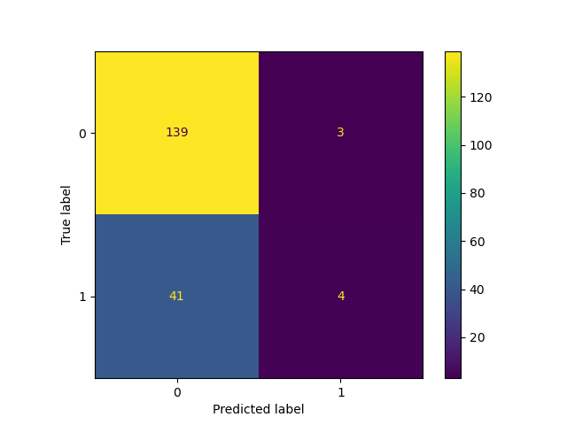
Create ConfusionMatrixDisplay
With the fitted model, we compute the predictions of the model on the test dataset. These predictions are used to compute the confustion matrix which is plotted with the
ConfusionMatrixDisplay
from sklearn.metrics import confusion_matrix
from sklearn.metrics import ConfusionMatrixDisplay

y_pred = clf.predict(X_test)
cm = confusion_matrix(y_test, y_pred)

cm_display = ConfusionMatrixDisplay(cm).plot()
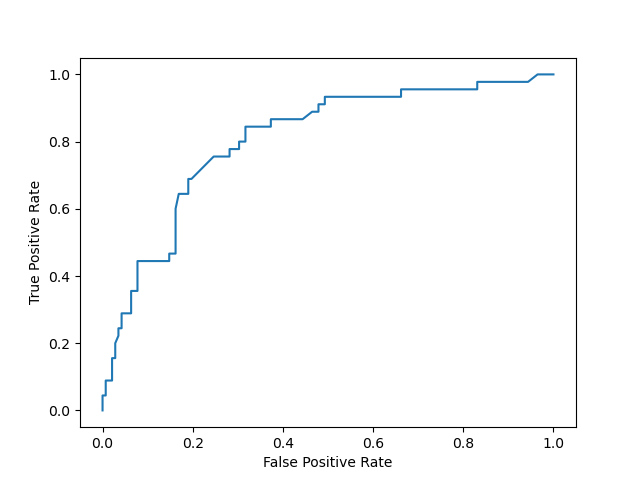
Create RocCurveDisplay
The roc curve requires either the probabilities or the non-thresholded decision values from the estimator. Since the logistic regression provides a decision function, we will use it to plot the roc curve:
from sklearn.metrics import roc_curve
from sklearn.metrics import RocCurveDisplay

y_score = clf.decision_function(X_test)

fpr, tpr, _ = roc_curve(y_test, y_score, pos_label=clf.classes_[1])
roc_display = RocCurveDisplay(fpr=fpr, tpr=tpr).plot()
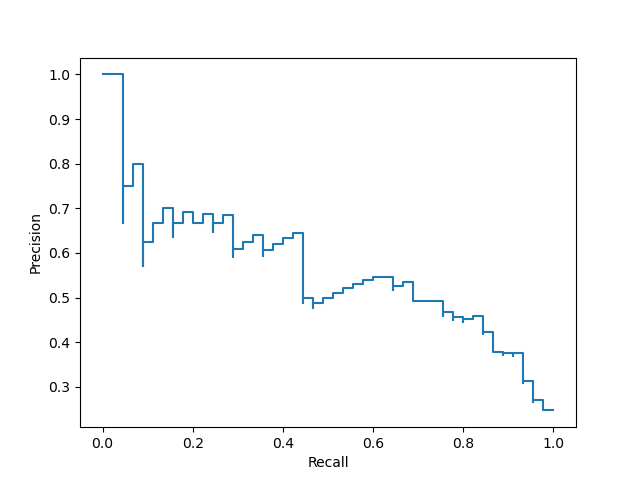
Create PrecisionRecallDisplay
Similarly, the precision recall curve can be plotted using
y_scorefrom the prevision sections.
from sklearn.metrics import precision_recall_curve
from sklearn.metrics import PrecisionRecallDisplay

prec, recall, _ = precision_recall_curve(y_test, y_score, pos_label=clf.classes_[1])
pr_display = PrecisionRecallDisplay(precision=prec, recall=recall).plot()
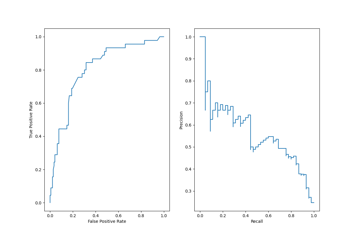
Combining the display objects into a single plot
The display objects store the computed values that were passed as arguments. This allows for the visualizations to be easliy combined using matplotlib’s API. In the following example, we place the displays next to each other in a row.
import matplotlib.pyplot as plt

fig, (ax1, ax2) = plt.subplots(1, 2, figsize=(12, 8))

roc_display.plot(ax=ax1)
pr_display.plot(ax=ax2)
plt.show()
Total running time of the script: ( 0 minutes 0.323 seconds)