Note
Go to the end to download the full example code or to run this example in your browser via JupyterLite or Binder
Nearest Centroid Classification
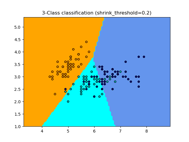
Sample usage of Nearest Centroid classification. It will plot the decision boundaries for each class.
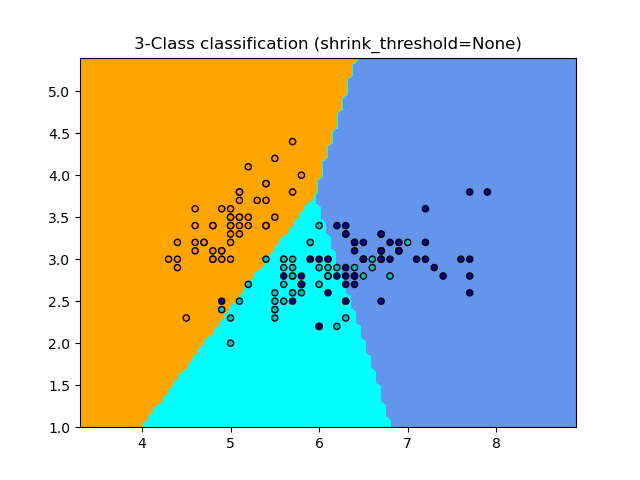
None 0.8133333333333334
0.2 0.82
import matplotlib.pyplot as plt
import numpy as np
from matplotlib.colors import ListedColormap

from sklearn import datasets
from sklearn.inspection import DecisionBoundaryDisplay
from sklearn.neighbors import NearestCentroid

# import some data to play with
iris = datasets.load_iris()
# we only take the first two features. We could avoid this ugly
# slicing by using a two-dim dataset
X = iris.data[:, :2]
y = iris.target

# Create color maps
cmap_light = ListedColormap(["orange", "cyan", "cornflowerblue"])
cmap_bold = ListedColormap(["darkorange", "c", "darkblue"])

for shrinkage in [None, 0.2]:
    # we create an instance of Nearest Centroid Classifier and fit the data.
    clf = NearestCentroid(shrink_threshold=shrinkage)
    clf.fit(X, y)
    y_pred = clf.predict(X)
    print(shrinkage, np.mean(y == y_pred))

    _, ax = plt.subplots()
    DecisionBoundaryDisplay.from_estimator(
        clf, X, cmap=cmap_light, ax=ax, response_method="predict"
    )

    # Plot also the training points
    plt.scatter(X[:, 0], X[:, 1], c=y, cmap=cmap_bold, edgecolor="k", s=20)
    plt.title("3-Class classification (shrink_threshold=%r)" % shrinkage)
    plt.axis("tight")

plt.show()
Total running time of the script: (0 minutes 0.161 seconds)