Note
Go to the end to download the full example code or to run this example in your browser via JupyterLite or Binder
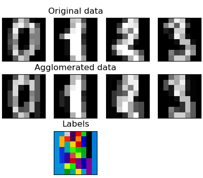
Feature agglomeration
These images show how similar features are merged together using feature agglomeration.
# Code source: Gaël Varoquaux
# Modified for documentation by Jaques Grobler
# License: BSD 3 clause

import matplotlib.pyplot as plt
import numpy as np

from sklearn import cluster, datasets
from sklearn.feature_extraction.image import grid_to_graph

digits = datasets.load_digits()
images = digits.images
X = np.reshape(images, (len(images), -1))
connectivity = grid_to_graph(*images[0].shape)

agglo = cluster.FeatureAgglomeration(connectivity=connectivity, n_clusters=32)

agglo.fit(X)
X_reduced = agglo.transform(X)

X_restored = agglo.inverse_transform(X_reduced)
images_restored = np.reshape(X_restored, images.shape)
plt.figure(1, figsize=(4, 3.5))
plt.clf()
plt.subplots_adjust(left=0.01, right=0.99, bottom=0.01, top=0.91)
for i in range(4):
    plt.subplot(3, 4, i + 1)
    plt.imshow(images[i], cmap=plt.cm.gray, vmax=16, interpolation="nearest")
    plt.xticks(())
    plt.yticks(())
    if i == 1:
        plt.title("Original data")
    plt.subplot(3, 4, 4 + i + 1)
    plt.imshow(images_restored[i], cmap=plt.cm.gray, vmax=16, interpolation="nearest")
    if i == 1:
        plt.title("Agglomerated data")
    plt.xticks(())
    plt.yticks(())

plt.subplot(3, 4, 10)
plt.imshow(
    np.reshape(agglo.labels_, images[0].shape),
    interpolation="nearest",
    cmap=plt.cm.nipy_spectral,
)
plt.xticks(())
plt.yticks(())
plt.title("Labels")
plt.show()
Total running time of the script: (0 minutes 0.137 seconds)