Note
Click here to download the full example code or to run this example in your browser via Binder
Comparing Nearest Neighbors with and without Neighborhood Components Analysis
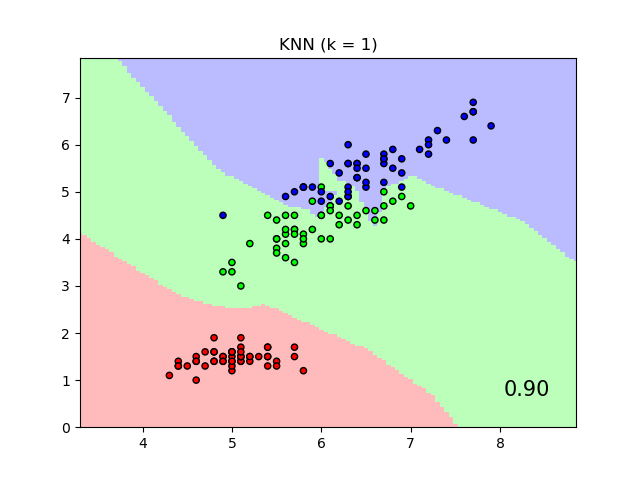
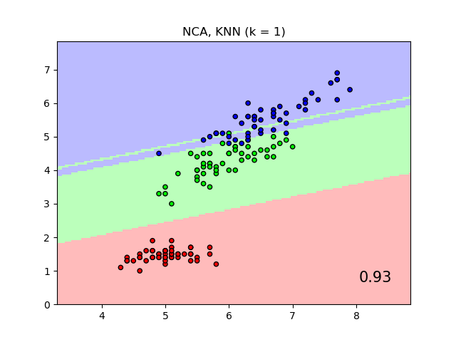
An example comparing nearest neighbors classification with and without Neighborhood Components Analysis.
It will plot the class decision boundaries given by a Nearest Neighbors classifier when using the Euclidean distance on the original features, versus using the Euclidean distance after the transformation learned by Neighborhood Components Analysis. The latter aims to find a linear transformation that maximises the (stochastic) nearest neighbor classification accuracy on the training set.
# License: BSD 3 clause

import numpy as np
import matplotlib.pyplot as plt
from matplotlib.colors import ListedColormap
from sklearn import datasets
from sklearn.model_selection import train_test_split
from sklearn.preprocessing import StandardScaler
from sklearn.neighbors import KNeighborsClassifier, NeighborhoodComponentsAnalysis
from sklearn.pipeline import Pipeline


n_neighbors = 1

dataset = datasets.load_iris()
X, y = dataset.data, dataset.target

# we only take two features. We could avoid this ugly
# slicing by using a two-dim dataset
X = X[:, [0, 2]]

X_train, X_test, y_train, y_test = train_test_split(
    X, y, stratify=y, test_size=0.7, random_state=42
)

h = 0.05  # step size in the mesh

# Create color maps
cmap_light = ListedColormap(["#FFAAAA", "#AAFFAA", "#AAAAFF"])
cmap_bold = ListedColormap(["#FF0000", "#00FF00", "#0000FF"])

names = ["KNN", "NCA, KNN"]

classifiers = [
    Pipeline(
        [
            ("scaler", StandardScaler()),
            ("knn", KNeighborsClassifier(n_neighbors=n_neighbors)),
        ]
    ),
    Pipeline(
        [
            ("scaler", StandardScaler()),
            ("nca", NeighborhoodComponentsAnalysis()),
            ("knn", KNeighborsClassifier(n_neighbors=n_neighbors)),
        ]
    ),
]

x_min, x_max = X[:, 0].min() - 1, X[:, 0].max() + 1
y_min, y_max = X[:, 1].min() - 1, X[:, 1].max() + 1
xx, yy = np.meshgrid(np.arange(x_min, x_max, h), np.arange(y_min, y_max, h))

for name, clf in zip(names, classifiers):

    clf.fit(X_train, y_train)
    score = clf.score(X_test, y_test)

    # Plot the decision boundary. For that, we will assign a color to each
    # point in the mesh [x_min, x_max]x[y_min, y_max].
    Z = clf.predict(np.c_[xx.ravel(), yy.ravel()])

    # Put the result into a color plot
    Z = Z.reshape(xx.shape)
    plt.figure()
    plt.pcolormesh(xx, yy, Z, cmap=cmap_light, alpha=0.8)

    # Plot also the training and testing points
    plt.scatter(X[:, 0], X[:, 1], c=y, cmap=cmap_bold, edgecolor="k", s=20)
    plt.xlim(xx.min(), xx.max())
    plt.ylim(yy.min(), yy.max())
    plt.title("{} (k = {})".format(name, n_neighbors))
    plt.text(
        0.9,
        0.1,
        "{:.2f}".format(score),
        size=15,
        ha="center",
        va="center",
        transform=plt.gca().transAxes,
    )

plt.show()
Total running time of the script: ( 0 minutes 0.749 seconds)