Note
Click here to download the full example code or to run this example in your browser via Binder
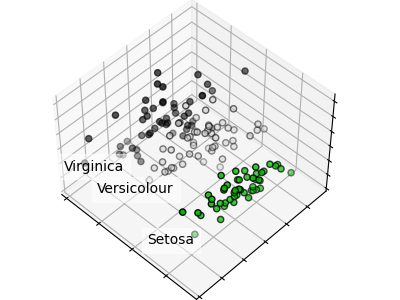
PCA example with Iris Data-set
Principal Component Analysis applied to the Iris dataset.
See here for more information on this dataset.
Out:
/home/circleci/project/examples/decomposition/plot_pca_iris.py:33: MatplotlibDeprecationWarning: Axes3D(fig) adding itself to the figure is deprecated since 3.4. Pass the keyword argument auto_add_to_figure=False and use fig.add_axes(ax) to suppress this warning. The default value of auto_add_to_figure will change to False in mpl3.5 and True values will no longer work in 3.6.  This is consistent with other Axes classes.
  ax = Axes3D(fig, rect=[0, 0, 0.95, 1], elev=48, azim=134)
# Code source: Gaël Varoquaux
# License: BSD 3 clause

import numpy as np
import matplotlib.pyplot as plt
from mpl_toolkits.mplot3d import Axes3D


from sklearn import decomposition
from sklearn import datasets

np.random.seed(5)

iris = datasets.load_iris()
X = iris.data
y = iris.target

fig = plt.figure(1, figsize=(4, 3))
plt.clf()
ax = Axes3D(fig, rect=[0, 0, 0.95, 1], elev=48, azim=134)

plt.cla()
pca = decomposition.PCA(n_components=3)
pca.fit(X)
X = pca.transform(X)

for name, label in [("Setosa", 0), ("Versicolour", 1), ("Virginica", 2)]:
    ax.text3D(
        X[y == label, 0].mean(),
        X[y == label, 1].mean() + 1.5,
        X[y == label, 2].mean(),
        name,
        horizontalalignment="center",
        bbox=dict(alpha=0.5, edgecolor="w", facecolor="w"),
    )
# Reorder the labels to have colors matching the cluster results
y = np.choose(y, [1, 2, 0]).astype(float)
ax.scatter(X[:, 0], X[:, 1], X[:, 2], c=y, cmap=plt.cm.nipy_spectral, edgecolor="k")

ax.w_xaxis.set_ticklabels([])
ax.w_yaxis.set_ticklabels([])
ax.w_zaxis.set_ticklabels([])

plt.show()
Total running time of the script: ( 0 minutes 0.077 seconds)